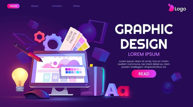
5 Essential Principles of Captivating Graphic Design
Graphic design plays a crucial role in how visual information is perceived, and understanding the principles behind captivating designs can significantly enhance your work. Here are 5 essential principles that will help you create visually appealing graphics:
- Balance: Strive for a sense of equilibrium in your compositions, using symmetrical or asymmetrical balance to lead the viewer’s eye.
- Contrast: Utilize contrasting colors, shapes, and sizes to draw attention to specific elements, making your design engaging and dynamic.
- Alignment: Maintain a clean and organized layout by aligning elements to create a coherent flow, which helps guide the viewer’s journey through the design.
- Repetition: Implementing consistent elements, such as colors and fonts, throughout your design creates unity and reinforces brand identity.
- White Space: Embrace the power of white space to give your design breathing room, allowing important elements to stand out while avoiding visual clutter.
How to Choose the Right Color Palette for Your Next Project
Choosing the right color palette for your next project is crucial to ensuring its success. A well-thought-out palette not only enhances the visual appeal but also communicates the intended message. To start, consider the emotional and psychological effects of colors. For instance, blue often evokes feelings of calmness and trust, whereas red can signify energy and passion. Make a list of the core values and messages you want to convey and align them with appropriate colors.
Once you have a clear understanding of what emotions you want to elicit, it’s time to explore different color schemes. Here are some popular options to consider:
- Monochromatic - various shades of one color
- Analogous - colors that are next to each other on the color wheel
- Complementary - colors that are opposite each other
The Psychology Behind Effective Graphic Design: What Captivates Your Audience?
Understanding the psychology behind effective graphic design is essential for capturing and retaining the attention of your audience. One key element is the use of color; different colors evoke different emotions and can influence perceptions. For instance, warm colors like red and orange can create a sense of urgency, while cool colors like blue and green promote calmness and trust. Additionally, employing principles such as contrast and balance helps guide the viewer's eye, making the content more appealing and easier to digest.
Another critical factor in graphic design is the use of typography. Fonts can significantly impact readability and convey your brand's personality. For example, serif fonts often evoke a sense of tradition and reliability, whereas sans-serif fonts present a modern and clean aesthetic. Furthermore, the placement and size of text elements can create a hierarchy that directs the audience's focus. By combining color psychology with thoughtful typography, designers can effectively engage audiences and enhance their overall experience.