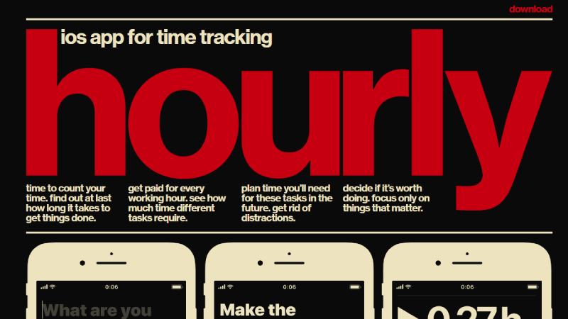
The Art of Web Typography: Choosing the Right Fonts for Your Site
Typography is a critical element of web design that often gets overlooked. The art of web typography involves not just the selection of fonts, but also their arrangement, size, and color, all of which contribute to the overall user experience. When choosing fonts for your site, consider the tone of your content and your target audience. For instance, Smashing Magazine suggests selecting fonts that align with your brand's identity and evoke the right emotions in your visitors.
Additionally, it's essential to focus on legibility and readability. Many fonts may look visually appealing, but if they're difficult to read, they can deter visitors from engaging with your content. It's advisable to use a limited number of fonts—ideally, no more than two or three—to maintain visual cohesion across your site. Resources like Typography.com provide excellent guidelines on font pairing and usability, helping you navigate the intricate landscape of web typography.
10 Essential Typography Tips for a Harmonious Web Design
Typography plays a crucial role in shaping the aesthetics and functionality of web design. To create a harmonious experience, start by ensuring a consistent font family throughout your site. Choose a primary font for headings and a complementary font for body text. This approach helps maintain visual hierarchy and enhances readability. For an excellent guide on web typography, refer to Smashing Magazine's insights.
Next, pay attention to font sizes and line spacing. Ensure that your text is large enough to be legible on all devices, with a base size of at least 16px for body text. Utilize white space effectively to create balance; too much clutter can overwhelm readers. For more tips on achieving this balance, check out Creative Bloq's advice on mastering white space in web design.
How Typography Affects User Experience: A Deep Dive
Typography plays a crucial role in shaping User Experience (UX), as it directly influences how users engage with content. The choice of font, size, spacing, and color can either enhance or hinder readability, which in turn affects users' understanding and retention of information. For instance, according to the Smashing Magazine, well-chosen typography can lead to improved user satisfaction and lower bounce rates. A readable font size not only ensures that content is accessible across various devices, but it also encourages users to invest time in your website, thus improving overall interaction.
Furthermore, the emotional response elicited by typography contributes significantly to the overall user experience. Different typefaces convey different moods—serif fonts often evoke a sense of tradition and trust, while sans-serif fonts may feel more modern and clean. A study from Nielsen Norman Group highlights how font choices can impact users' perceptions of authority and reliability. This means that not only should typography be visually appealing, but it should also align with the brand's voice and the user's expectations, reinforcing the narrative that typography is not just decorative but a vital component of the user journey.
